Gallery Wall Layout Ideas and How to Plan One
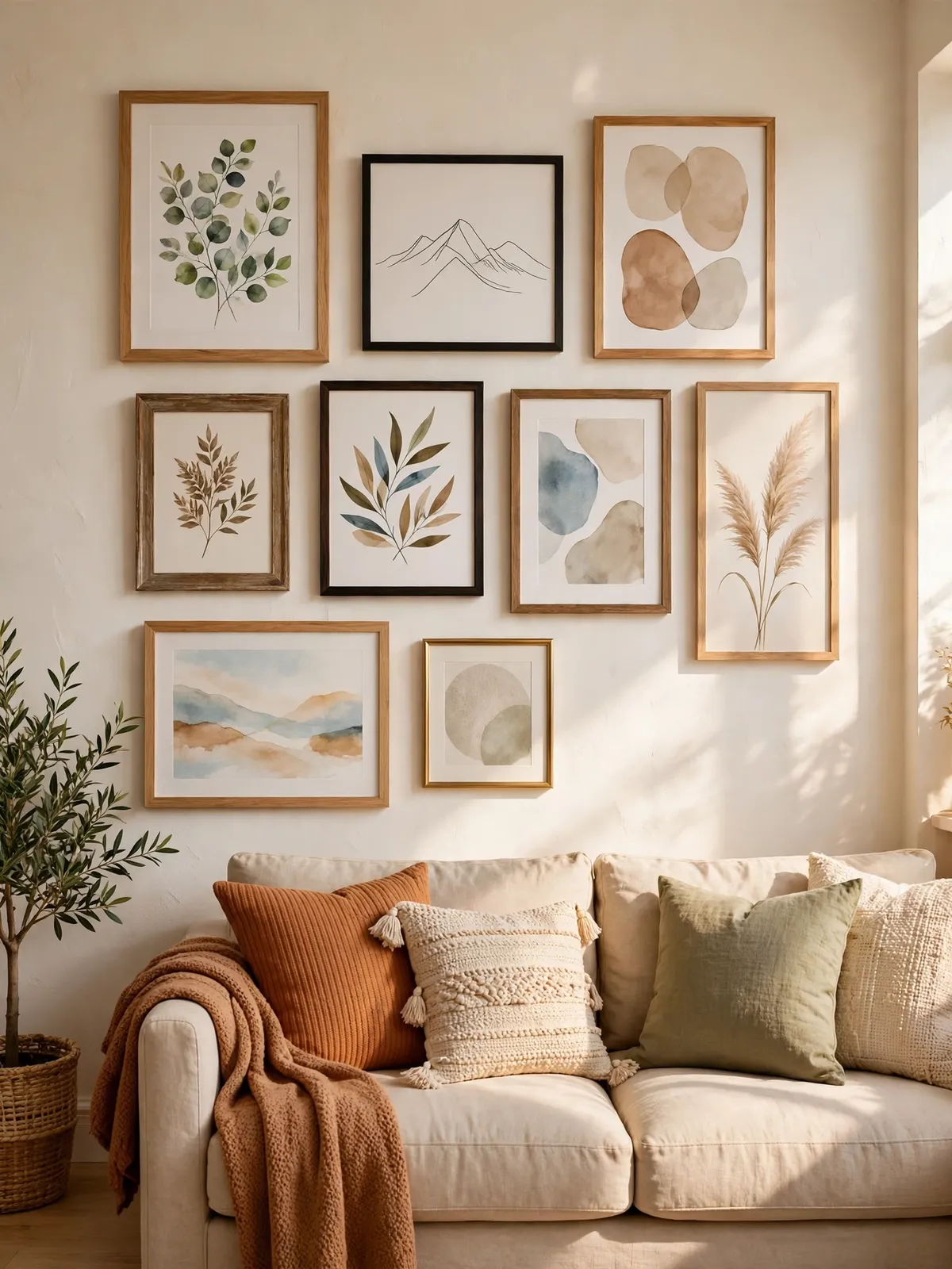
A gallery wall is one of the easiest ways to make a plain wall feel finished. A group of frames, hung with a little thought, can turn a blank stretch of wall into the best part of the room. You do not need expensive art or a designer to pull it off — just a plan and a bit of patience.
The trick is to plan before you pick up a hammer. A few minutes spent measuring, laying frames on the floor, and trying a layout on paper will save you from a wall full of extra holes. This guide walks you through the whole thing, step by step, so your gallery wall looks like it was meant to be there.
1. Pick Your Wall and Decide on a Style
Start by choosing the right wall. A gallery wall works best on a wall that is mostly empty — above a sofa, along a hallway, or on the wall behind a bed. Stand back and look at the wall as a whole, not just the spot where the frames will go, so the finished wall fits the room and not just the furniture under it.
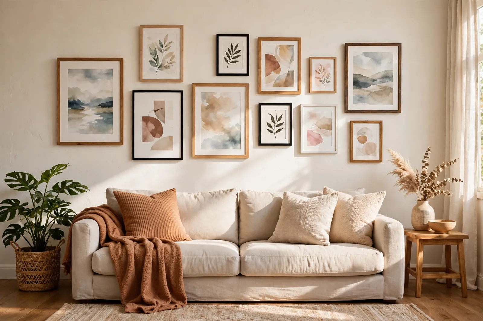
Then decide what style you want. Some people love matching black frames in neat rows, while others like a mix of wood, white, and metal frames in all different sizes. Neither one is wrong, but picking one direction first keeps the wall from looking random. Gather the art and photos you already own, lay them on a table, and see which pieces look good together.
2. Gallery Wall Layout Ideas That Work in Real Homes
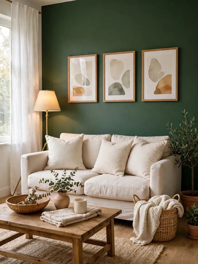
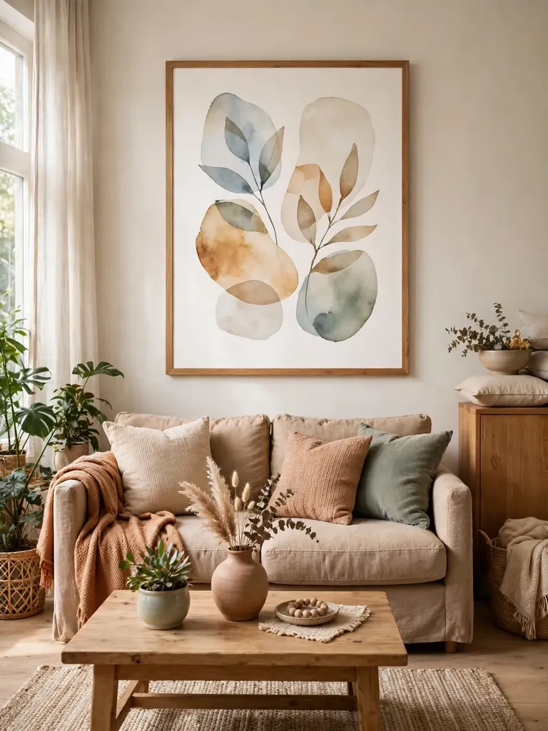
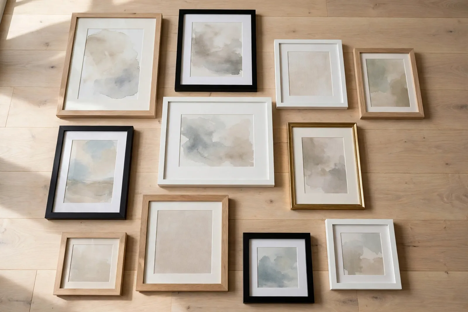
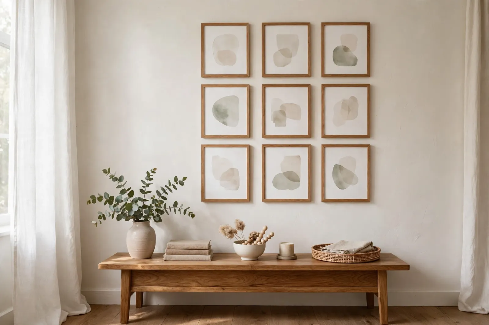
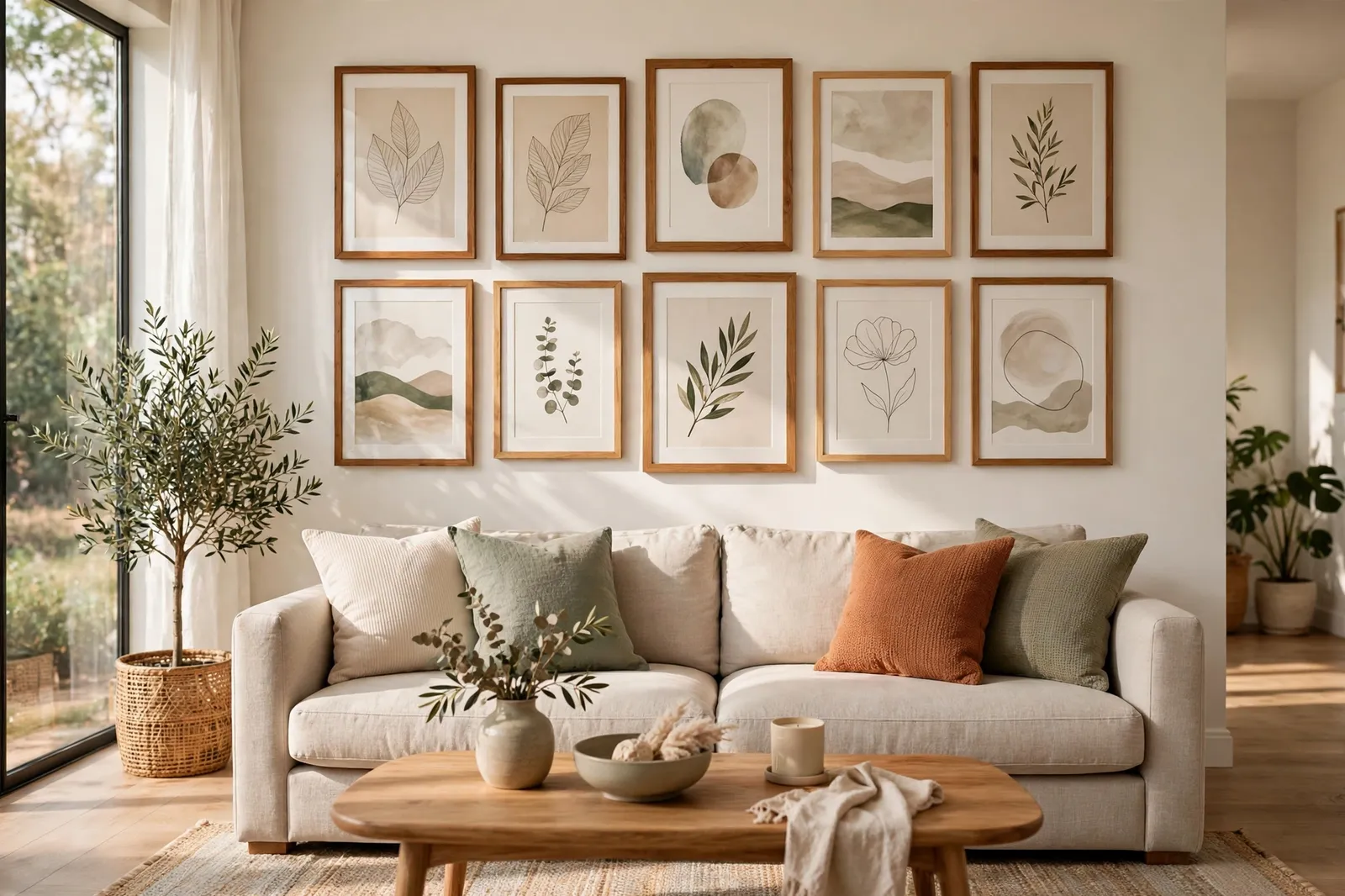
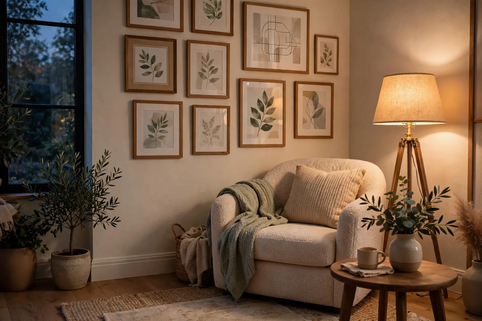
The most loved gallery wall layout ideas are the simple ones. A grid of same-size frames looks neat and calm, and it works well in a hallway or a small room. A salon-style wall — frames of different sizes grouped around one big piece in the middle — feels relaxed and works great above a sofa or a bed.
Other ideas are just as easy. A single straight row of three or four frames suits a narrow wall, and a ledge-style gallery, where frames lean on a picture shelf, lets you swap pieces whenever you like. Pick the layout that fits your wall shape and the frames you already have, not the one that looks best in a photo of someone else's home.
3. Choose a Layout Shape That Fits the Wall
Every wall has a shape, and the best gallery walls follow it. A wide, low wall above a sofa suits a wide, low arrangement, while a tall, narrow wall suits a stacked column of frames. When the shape of the wall and the shape of the gallery match, the whole thing looks calm and planned.
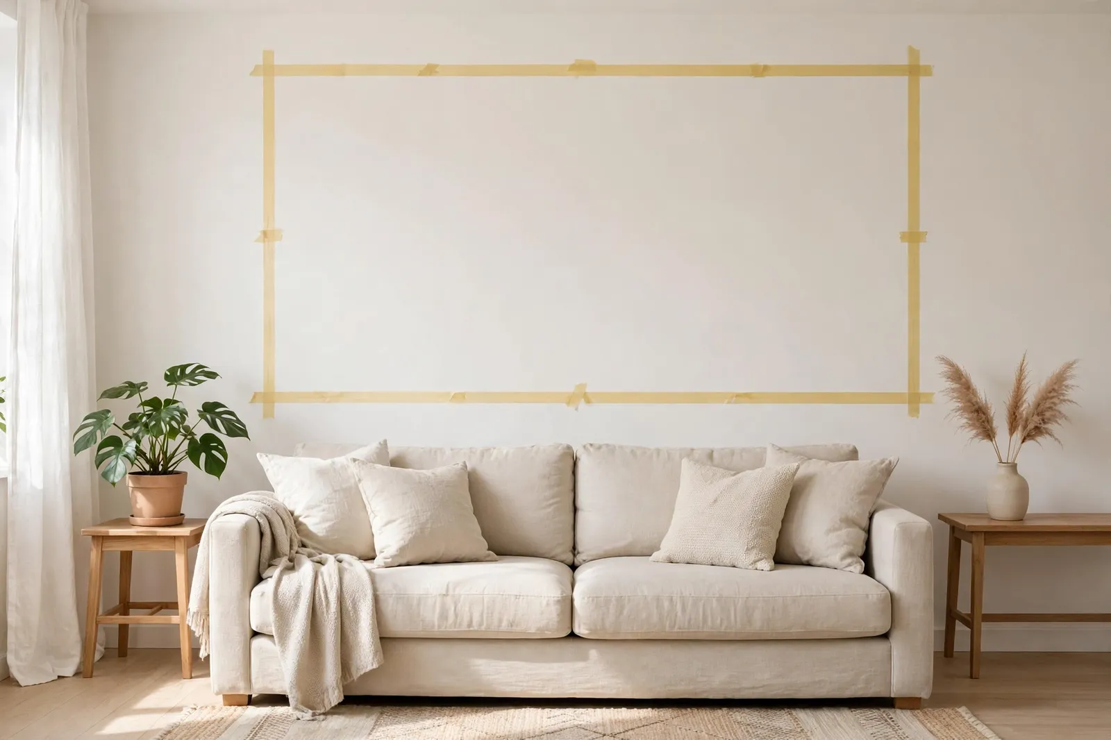
Measure the wall before you decide anything. Mark the width and height of the space you want to fill with a bit of painter's tape on the wall, then step back and look at it. A gallery that fills about two-thirds of the wall width above a sofa usually looks right — much smaller and it looks lost, much bigger and it crowds the room.
4. Start with One Anchor Piece and Build Around It
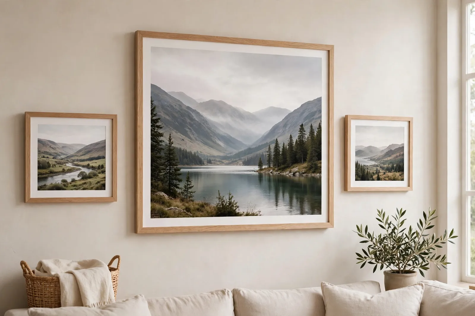
Every good gallery wall has one piece that anchors the rest. Pick your biggest or favorite frame and hang it first, roughly at the center of the space you marked. Everything else gets placed around it, so the wall grows from one clear starting point instead of a bunch of frames fighting for attention.
Place the next two or three biggest pieces around the anchor, leaving even gaps between them. Then fill in with smaller frames, working outward. If a piece does not fit the spot you planned for it, move it to another gap rather than forcing it in — a gallery wall looks best when each frame has a little breathing room.
5. Mix Frame Sizes Without Making It Messy
Mixing frame sizes is what makes a gallery wall interesting, but too much mixing makes it look messy. A good rule is to use two or three sizes at most — a couple of large frames, a few medium ones, and some small ones to fill the gaps. Stick with that mix and the wall stays varied without turning chaotic.
Keep the frame colors close together too. Matching frames are the easiest route, but a mix of black and wood, or white and gold, works if you repeat each color at least twice. The same goes for the art itself — a mix of photos, prints, and one or two small objects looks great as long as the colors feel like they belong in the same room.
6. Use Paper Templates Before You Hammer Anything
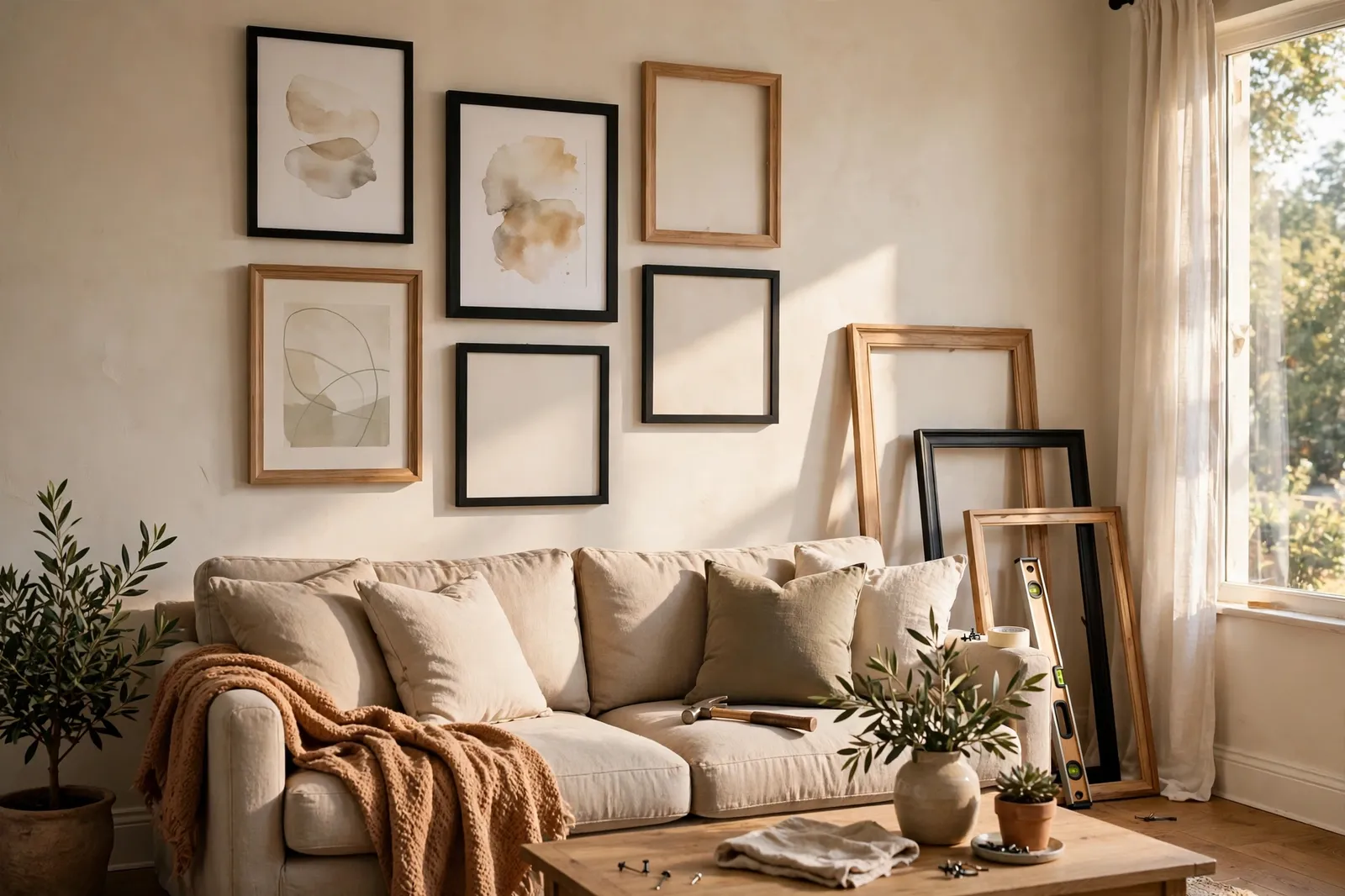
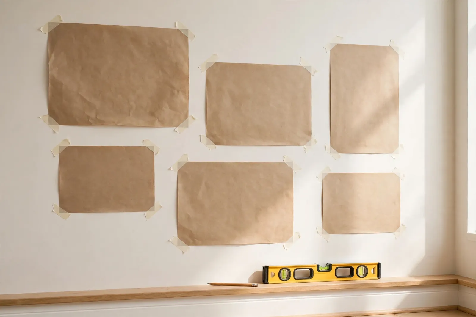
This is the step most people skip, and it is the one that saves the most trouble. Trace each frame onto brown paper or old wrapping paper, cut out the shapes, and tape them to the wall with painter's tape. You can move them around, swap two pieces, or shift the whole layout up or down — all without a single hole in the wall.
Live with the paper layout for a day if you can. Walk past it a few times, look at it from the sofa and from the doorway, and notice what feels off. A piece that looks too high or a gap that looks too wide is easy to fix on paper. Once the paper version feels right, mark the nail spots right through the paper and hang the real frames one by one.
7. Space the Frames Evenly and Hang at Eye Level
Even spacing is what makes a gallery wall look put together instead of thrown up. Keep the gaps between frames between two and three inches, and try to keep them the same all the way across. Uneven gaps are the first thing your eye notices, even if you cannot quite say why the wall looks off.
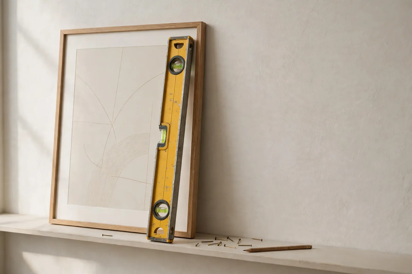
Hang the center of the gallery at eye level, which is about 57 inches from the floor for most people. If the gallery sits above a sofa or a bed, leave about six to eight inches between the furniture and the bottom of the lowest frame. A level is your best friend here — check each frame before you move on to the next one.
8. Fill the Gaps with Small Pieces
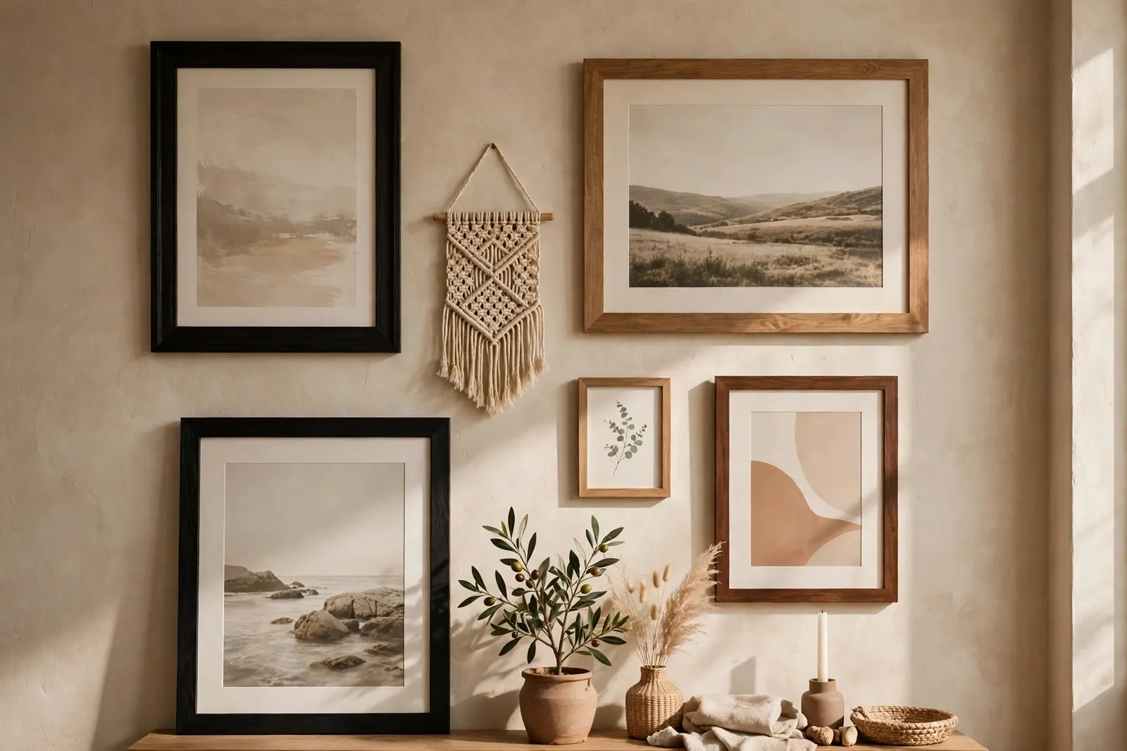
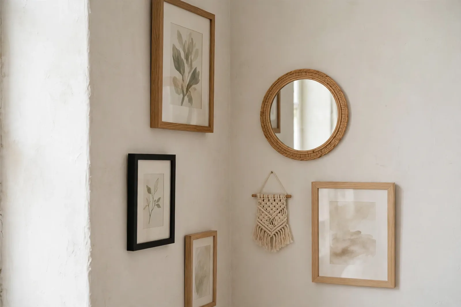
Once the big frames are up, the wall often has a few small gaps that look empty. This is where small pieces shine — a tiny print, a small mirror, a woven wall hanging, or even a small shelf with a plant. Little pieces like these make the wall feel complete without adding more big frames.
Do not rush to fill every gap, though. A gallery wall needs a little empty space to breathe, and a wall packed edge to edge with frames feels crowded. Add one small piece at a time, step back, and look. If the wall feels balanced, stop there — you can always add a piece later when you find the right one.
9. Step Back, Fix What Feels Off, and Enjoy It
When the last frame is up, step back — all the way across the room — and look at the whole wall. Check the spacing, check the heights, and check that nothing is leaning. Small fixes are normal: nudge a frame a little to the left, straighten one that tilts, or swap two pieces that feel unbalanced.
Then leave it alone for a day and look at it again with fresh eyes. Most gallery walls need one or two tiny tweaks after the first look, and that is fine. Once it feels right, enjoy it. A gallery wall is meant to grow over time, so do not be afraid to change a piece or add a new one when you find something you love.
Frequently Asked Questions
How do I plan a gallery wall layout?
Start by picking your wall and measuring the space you want to fill, then lay all your frames on the floor and arrange them into a layout you like. Trace each frame onto paper, tape the paper shapes to the wall, and move them around until the layout feels right. Only then should you start hanging — planning on paper first saves you from extra holes in the wall.
What is the best spacing between frames on a gallery wall?
Keep the gaps between frames between two and three inches, and keep them the same across the whole wall. Even spacing is what makes a gallery wall look neat and planned. Gaps wider than three inches make the frames feel disconnected, while gaps under two inches make the wall feel crowded.
How high should a gallery wall start?
Hang the center of the gallery at about 57 inches from the floor, which is eye level for most people. If the gallery sits above a sofa, a bed, or a console table, leave about six to eight inches between the top of the furniture and the bottom of the lowest frame so the wall and the furniture feel connected.
Can I mix different frame styles on a gallery wall?
Yes, you can mix frame styles, but keep it simple — two or three frame colors at most, and repeat each color at least twice so the mix looks planned. Matching frames are the easiest choice, while a mix of black and wood or white and gold also works well. What matters most is that the frames feel like they belong in the same room.
Related ideas
Accent Wall Ideas for Living Rooms and Bedrooms is a great next read if your gallery wall has you thinking about the wall itself, since it covers paint and panel ideas that make art stand out. Neutral Paint Colors for a Warm and Timeless Home helps you pick a wall color that lets your frames shine instead of fighting with them, and How to Choose a Whole-Home Color Palette shows how to tie the colors in your gallery wall into the rest of your home. You might also like Accent Wall Ideas for Living Rooms and Bedrooms and How to Hang Wall Art at the Right Height.