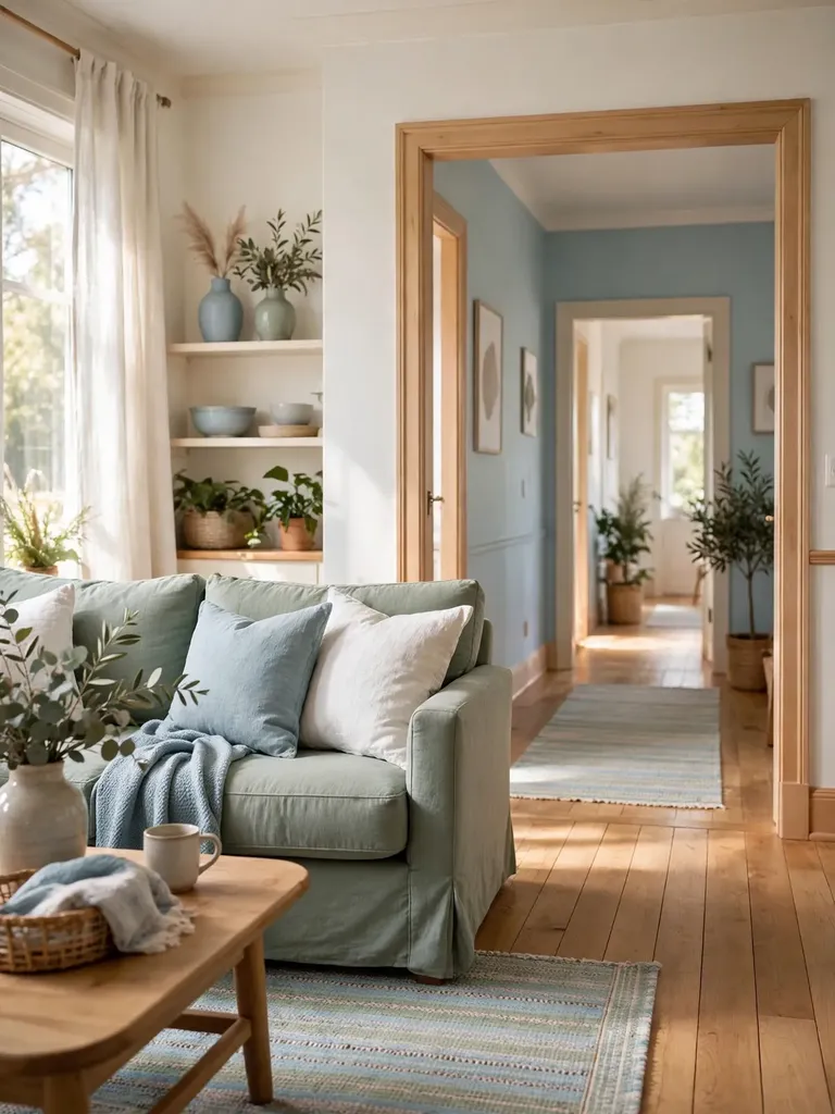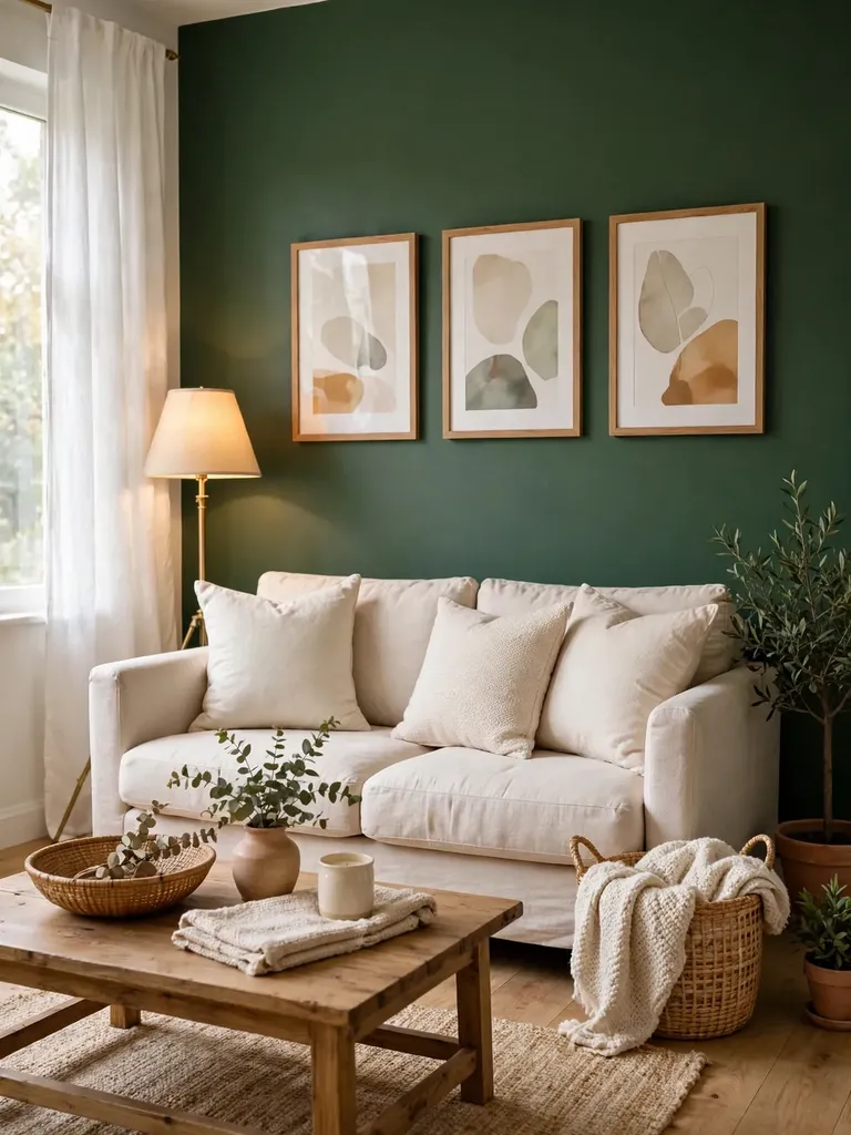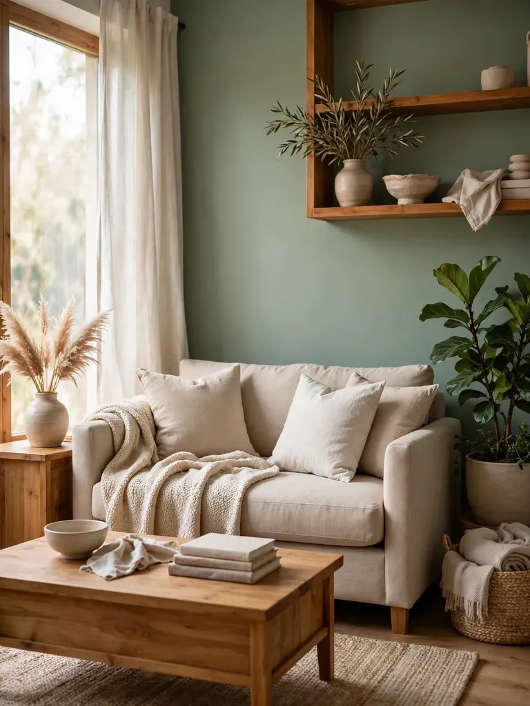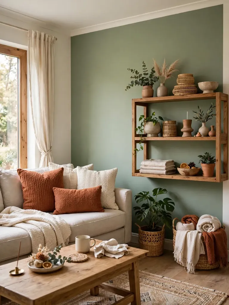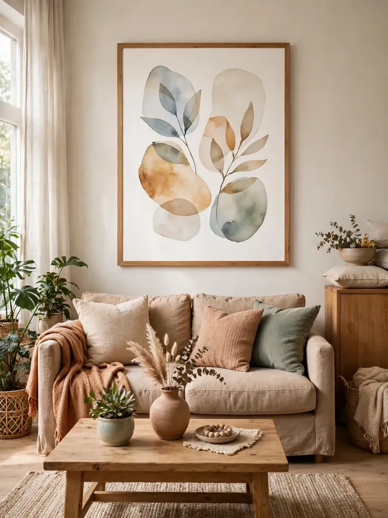
Neutral Paint Colors for a Warm and Timeless Home
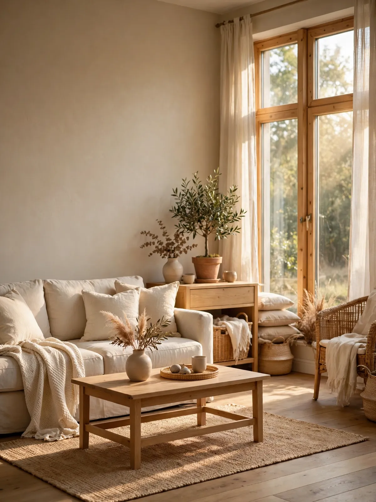
Picking a paint color sounds easy until you are standing in the paint aisle looking at a hundred shades of white. They all look the same on the little card, and then they look totally different on your wall. That is the tricky part about neutral paint colors — the good ones feel warm and easy to live with, while the wrong ones can make a room feel cold or flat.
The nice thing about neutrals is that you do not have to be brave to get a good result. Warm whites, soft beiges, and greiges work in almost any home, and they let your furniture and decor do the talking. This guide walks through the shades that work best, how to test them the right way, and the small mistakes to avoid so your walls feel warm and timeless for years.
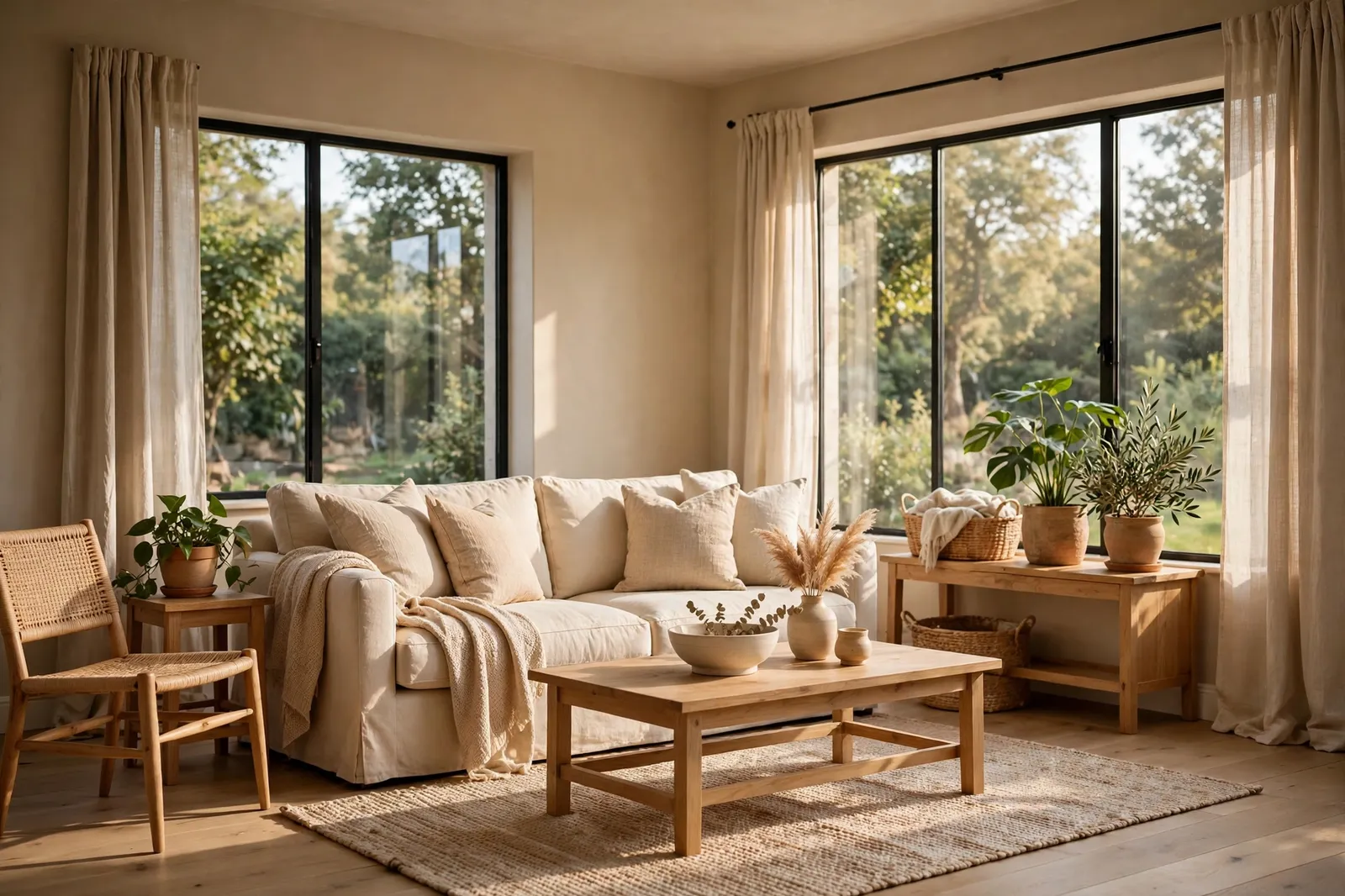
1. Why Neutral Paint Colors Never Go Out of Style
Neutral paint colors stay popular because they are easy to live with. A bright color can feel fun for a month and tiring after a year, but a warm neutral just sits quietly in the background and lets the room breathe. It works with almost any furniture, any season, and any style, from farmhouse to modern.
They also make decorating much simpler. When your walls are a soft warm neutral, you can change cushions, art, or curtains whenever you like without repainting. The room still feels pulled together because the walls are not fighting with anything in it. That is why designers keep coming back to neutrals, and why they hold up so well over time.
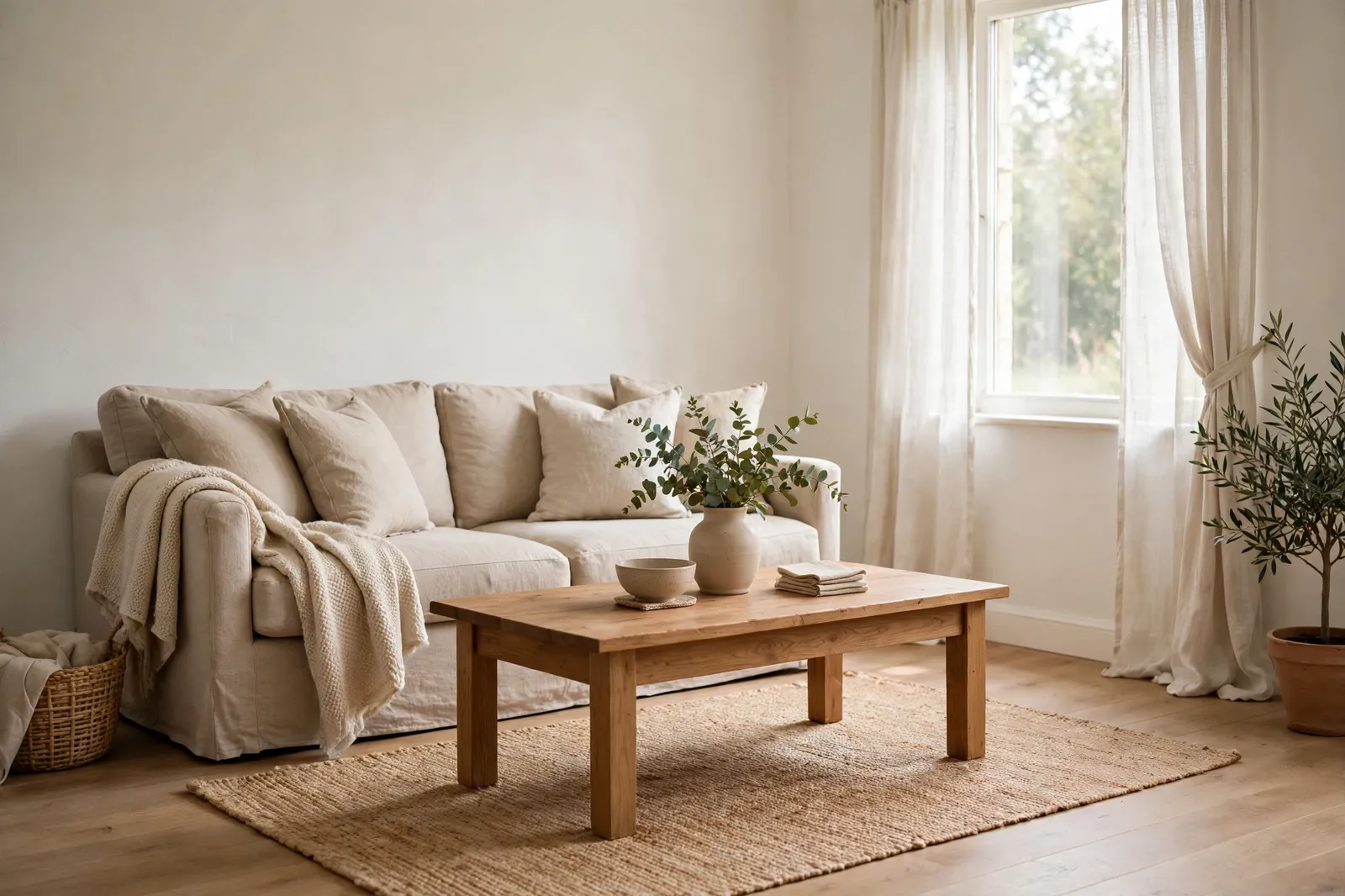
2. Warm Whites That Feel Cozy, Not Stark
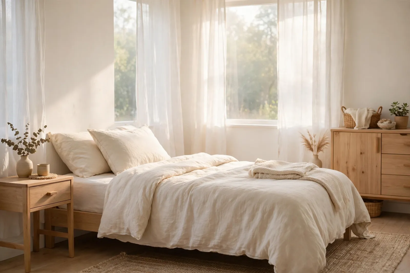
Not all white paint is the same, and that is where most people get stuck. A stark white with cool undertones can make a room feel like a hospital, while a warm white with a touch of yellow or cream feels soft and welcoming. Look for whites with names like warm white, ivory, or creamy — they have a gentle glow instead of a sharp glare.
Warm whites work best in rooms with lots of natural light, because the sun brings out their warmth. In a darker room, a warm white can look a little yellow, so test it first. Paint a big swatch on the wall and look at it in the morning and again at night. If it still feels soft and calm in both, you have found a good one.
3. Soft Beige and Greige: The Safe Middle Ground
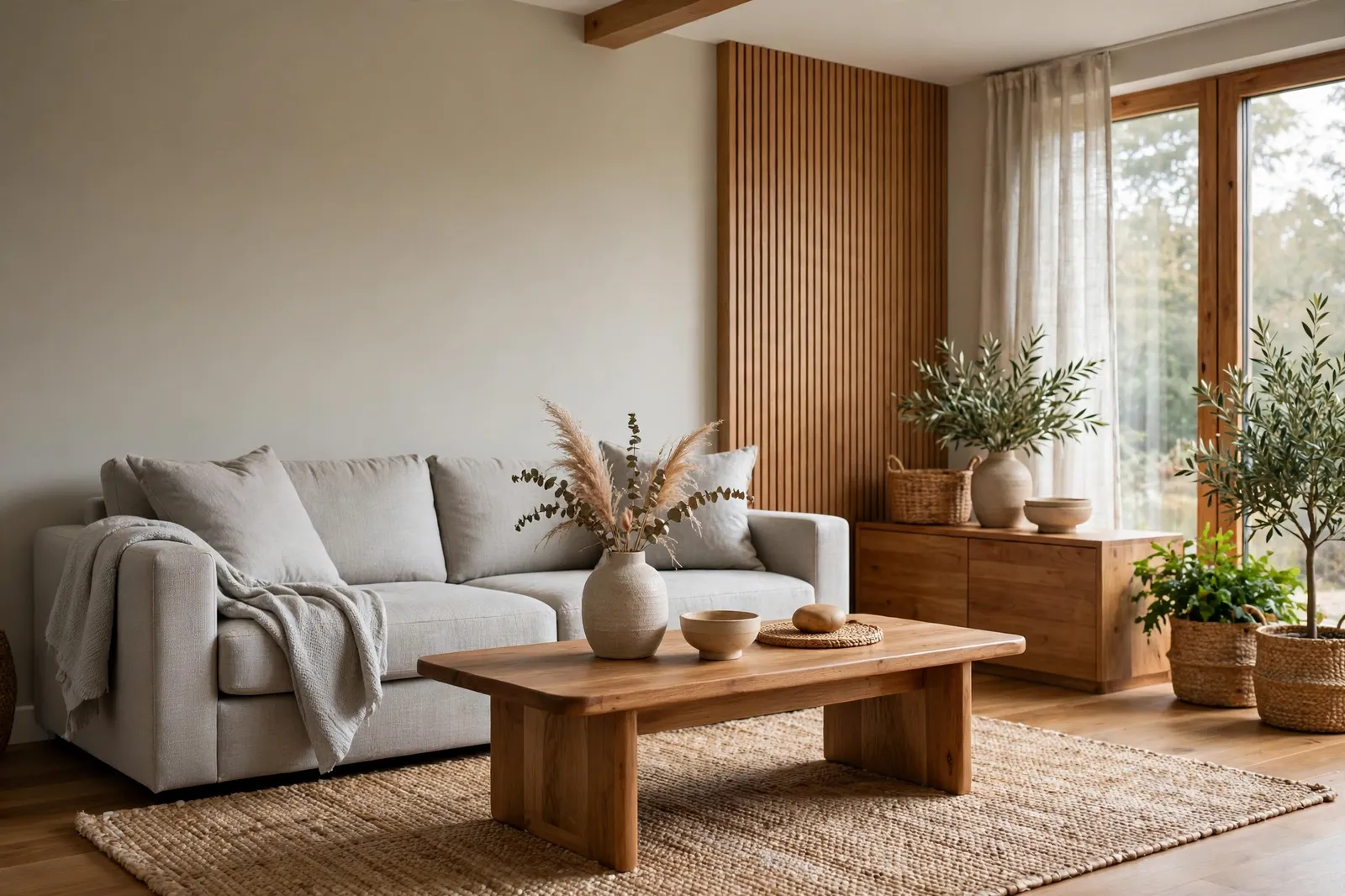
If plain white feels too plain, beige and greige are the next step. Beige is warm and classic, while greige — a mix of gray and beige — is a little cooler and more modern. Both are forgiving colors that hide small marks and look good with wood floors, which is a big plus in most homes.
Greige is a great pick if your furniture leans gray or your home has cool-toned floors. Beige works better with warm wood, brass, and earthy fabrics. Either way, go one shade lighter than you think you need, because paint always looks darker on a big wall than it does on a small card. A light hand keeps the room feeling open instead of heavy.
4. How to Test a Neutral Before You Commit
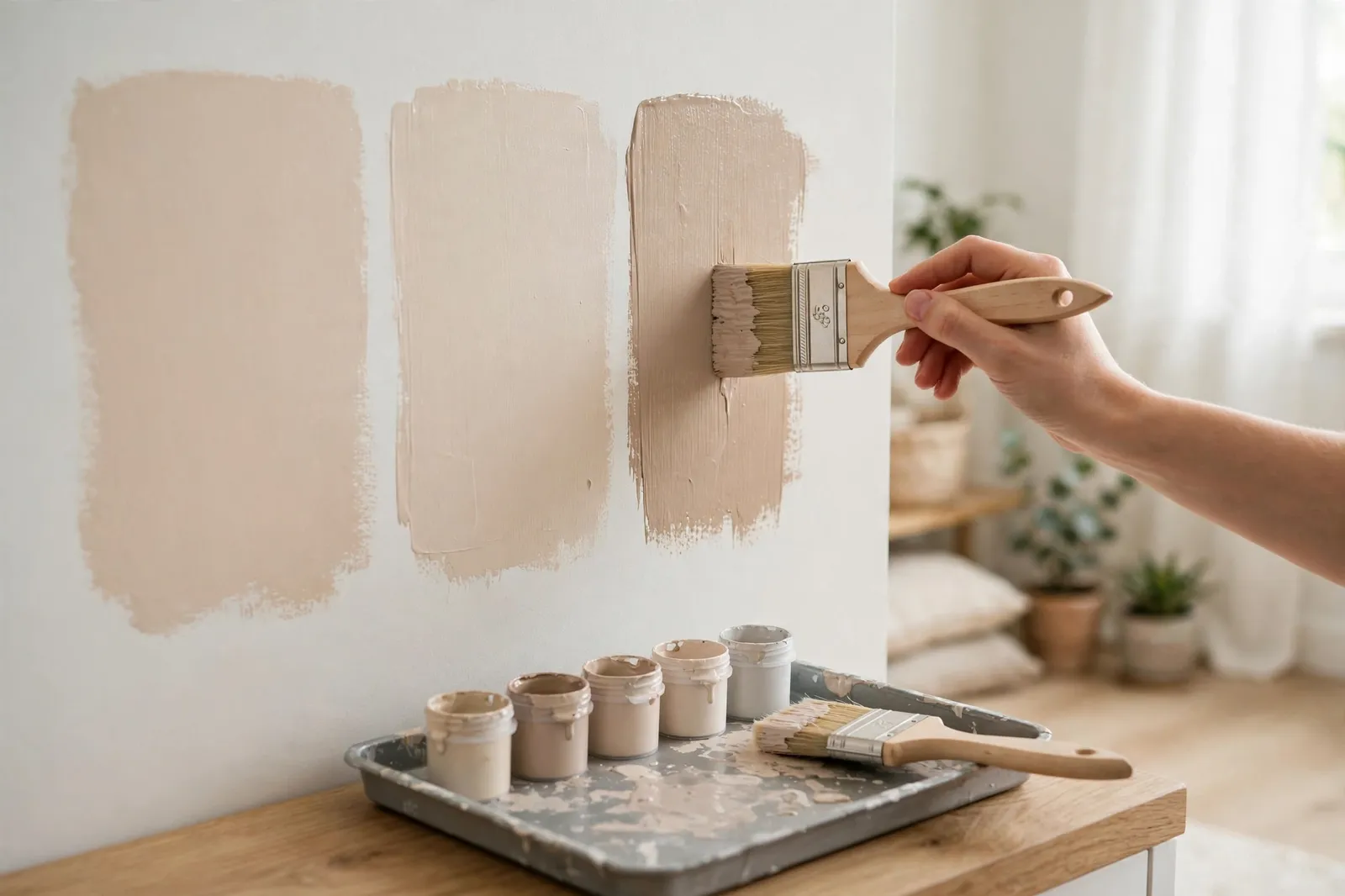
The single best thing you can do before buying a gallon of paint is test it properly. Paint stores sell small sample pots for a few dollars, and that small spend can save you from a big mistake. Paint a large square — at least two feet across — right on the wall you plan to paint, not on a piece of cardboard you hold up.
Live with the swatch for two or three days. Look at it in morning light, afternoon sun, and under your lamps at night. Move around the room and see how it looks next to your sofa, your floor, and your trim. If you still like it after a few days in all kinds of light, it is safe to buy the full amount.
5. Picking Undertones That Actually Work
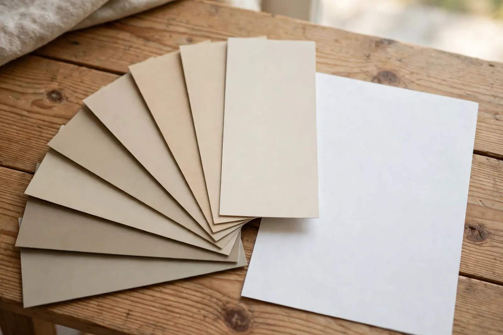
Every neutral paint has an undertone — a hint of yellow, pink, green, or gray hiding under the surface. That undertone is what makes one beige look warm and cozy and another look pink or muddy on your wall. It is also the part most people miss, which is why so many paint jobs end in disappointment.
Here is a simple trick: hold the paint card next to a plain white sheet of paper. The undertone will suddenly stand out — you will see the yellow, pink, or green clearly. Then check it against your fixed things, like your floors and countertops. If your floor has warm wood tones, pick a neutral with a warm undertone to match. If your kitchen counters are cool gray, a greige will sit much better than a yellow beige.
6. Warm Neutrals for Living Rooms and Bedrooms
Living rooms and bedrooms are where warm neutrals do their best work. A soft warm white or light beige makes a living room feel open and relaxed, and it gives you a calm backdrop for the sofa, the rug, and the art you already own. It also photographs well, if that matters to you, because the light bounces softly instead of glaring.
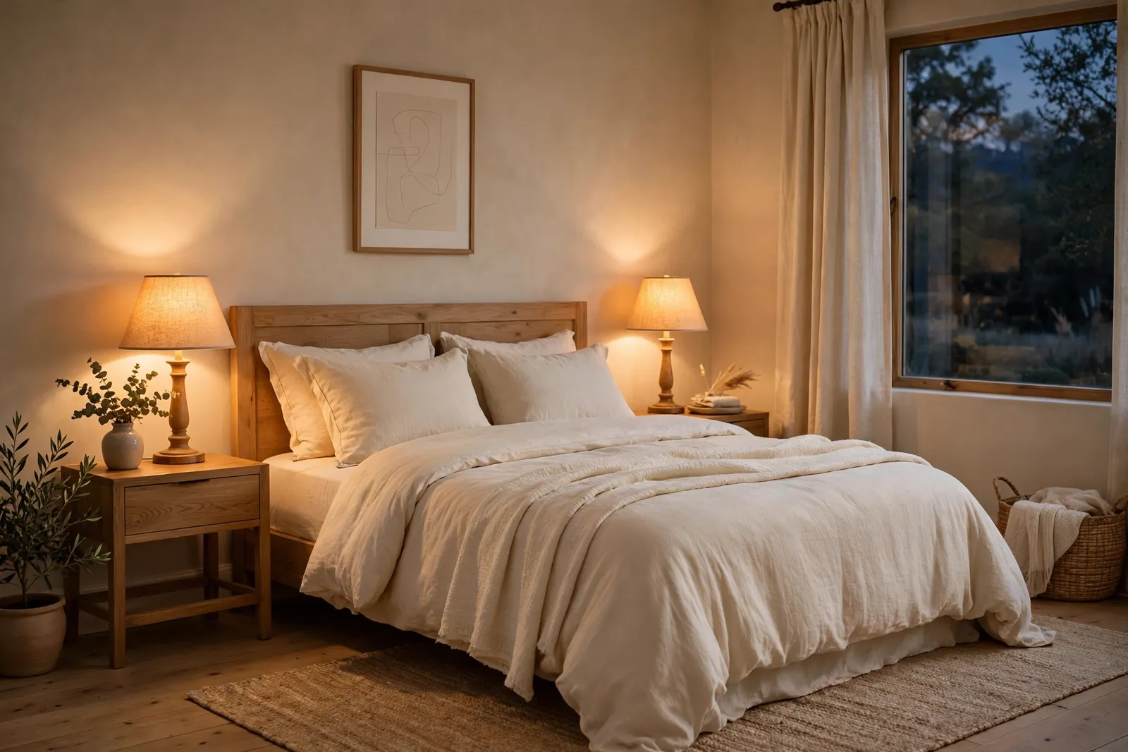
In a bedroom, go a touch warmer and a touch deeper. A creamy beige or a soft greige makes the room feel like a cocoon at night, especially with warm lamps and soft bedding. Avoid bright white in a bedroom — it can feel too sharp when you are trying to wind down. A warm neutral helps the room feel restful, which is the whole point of a bedroom.
7. Neutral Paint Colors for Kitchens and Bathrooms
Kitchens and bathrooms need neutrals that can handle steam, splashes, and a lot of cleaning. A warm white or light greige works well in both, as long as you pick the right finish. Eggshell or satin is a good middle ground — it wipes clean easily without looking shiny.
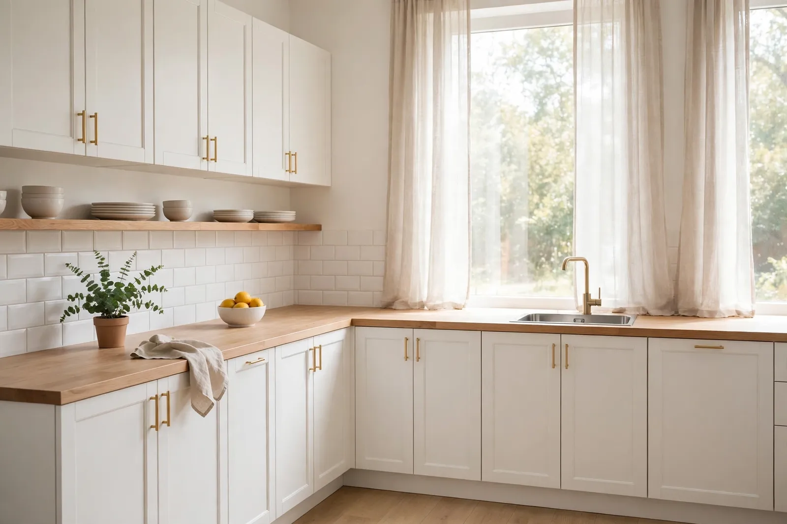
In the kitchen, a warm neutral on the walls pairs nicely with white cabinets and wood or stone counters. It keeps the room feeling bright without going cold. In a bathroom, the same warm white can make a small space feel bigger, especially with a big mirror and good lighting. Just make sure the paint is made for bathrooms, since regular paint can peel in all that steam.
8. Pairing Neutral Walls with Trim, Floors, and Furniture
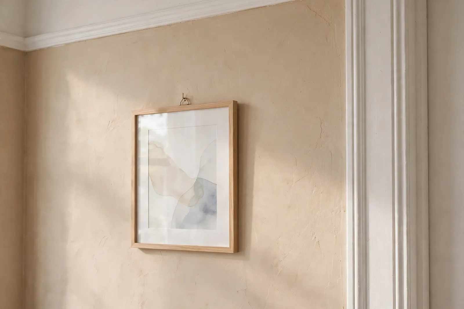
Neutral walls only look their best when the rest of the room works with them. The easiest rule is to keep your trim a clean warm white, one or two shades lighter than the walls. That small contrast frames the room and makes the wall color look intentional instead of accidental.
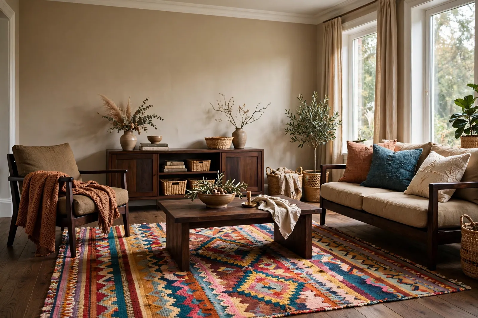
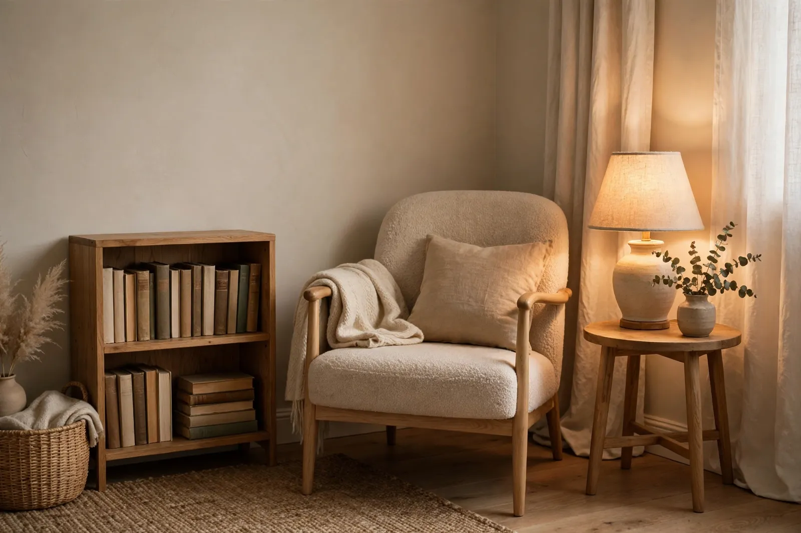
Floors and furniture matter too. Warm wood floors love beige and warm white, while gray-toned floors sit better with greige. For furniture, a neutral wall is a blank canvas — a dark wood table, a leather chair, or a colorful rug all pop against it. Add texture with linen cushions, a woven basket, or a wool throw, and the room will feel warm and layered instead of plain.
9. Small Mistakes to Avoid with Neutral Paint Colors
The most common mistake is picking a color from the card alone. Paint always looks different on a big wall in real light, so a shade that looked perfect in the store can turn pink, green, or gray at home. Always test first — it takes two days and saves a whole repaint.
Another mistake is going too dark. A mid-tone beige can look rich on the card but heavy on four walls, especially in a small or north-facing room. When in doubt, pick the lighter shade in the same color family. You can always add color with cushions and art, but you cannot easily lighten a wall that is too dark. And do not forget the ceiling — a bright white ceiling with warm walls can look mismatched, so use a warm white there too.
Frequently Asked Questions
What is the best neutral paint color for a warm home?
There is no single best shade, but warm whites like Benjamin Moore White Dove, soft beiges like Accessible Beige, and greiges like Agreeable Gray are loved for a reason. They have warm undertones that feel cozy in most homes. The best pick for you depends on your light and your floors, so test two or three before you decide.
Are warm neutral paint colors still popular?
Yes, warm neutrals are more popular than ever. Cool grays had their moment, but many people found them cold and hard to live with. Warm whites, beiges, and greiges feel softer and more welcoming, and they work with far more furniture styles, so they are likely to stay in style for a long time.
How do I know if a neutral paint color is warm or cool?
Hold the paint card next to a sheet of plain white paper. Warm neutrals will show a hint of yellow, cream, or pink, while cool ones lean gray, blue, or green. You can also look at the color in different light through the day — a warm neutral feels softer and cozier as the light changes, while a cool one can look flat or steely.
Should I use the same neutral paint color in every room?
You can, and many people do — it makes a home feel calm and connected. But you do not have to. A slightly deeper shade in the bedroom and a lighter one in the living room can work well, as long as the undertones match. What matters most is that the colors flow from one room to the next without clashing.
Related ideas
How to Choose a Whole-Home Color Palette is the perfect next read once you have a neutral you like, since it shows how to build a full palette around it. Home Decor Color Schemes and Wall Styling Ideas has more ideas for pairing your new wall color with art, shelves, and furniture, and Weekend Home Decor Projects That Refresh a Room is a great follow-up if you want a few easy weekend projects to go with your fresh paint. You might also like How to Choose a Whole-Home Color Palette and Accent Wall Ideas for Living Rooms and Bedrooms.